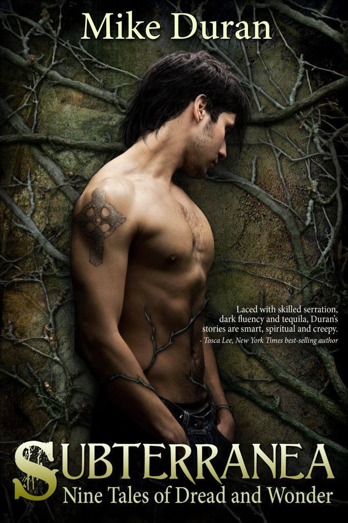
 In the next several weeks, I’ll be releasing an ebook anthology of short stories entitled “Subterranea: Nine Tales of Dread and Wonder.” The collection will be published exclusively on Amazon, with a paperback version available shortly thereafter through CreateSpace. Looks to be in the 120 page range. The ebook price will be 2.99.
These stories have been published in various venues over the last six or seven years. For instance, “When Bill Left the Porch” was a finalist in Dave Long’s (Bethany House senior acquisition editor) inaugural Faith in Fiction short story contest, and later published in Relief Journal (Spring 2007). “Someone in the Circle” was included in Robin Parrish‘s first-ever Infuze Magazine print anthology (coming in second in reader votes behind Michael Snyder’s inimitable “Russell Fink”) and “En Route to Inferno,” which was a part of Coach’s Midnight Diner’s Back from the Dead edition. Also included is a never-before-published sci-fi / surrealism piece entitled “Consonance.” The stories are mostly in the Speculative Fiction genre, but veer into dark fantasy, horror, and literary fiction.
The back cover blurb looks like this:
A subway project on the wrong side of Mother Nature. A neurotic man who drowns in the desert. Tequila swilling seminary students in search of a mythical healer. A war-torn interplanetary lounge for seekers of universal harmony. A military chaplain pursued by the very demon he evicted. A trip home, for the living and the dead. Muses and devils in the Inspirational octagon. A one-thousand pound man who carries something weightier than himself. A machine that can predict marital compatibility down to the most probable future.
Surrealism, horror, and occasional humor intersect in these nine short stories from the author of The Resurrection and The Telling.
Huge thank you to Ravven, who designed the cover art for me. She was referenced by another writer friend. Ravven was great work with, reasonably priced, and has some fantastic artwork (check out her Deviant Art profile for more). With Subterranea, I wanted more of an Urban Fantasy / Gothic vibe, with a human element. I think we’ve captured that with this cover, but would love to know your thoughts. Thanks, Ravven!
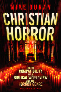
Also, I’ve got several non-fiction projects I’m looking forward to developing next year. One is a project on “Christian Horror” in which I hope to develop a lengthy apologetic for the viability of the genre, biblical tales of the grotesque and horrific, atheist dread versus biblical terror, and how a Judeo-Christian worldview frames classic horror. This will be aimed at fellow Christian writers and readers of the genre. Look for more details on that.



So excited to see this! Best of all wishes for this project, and thank you for the chance to work with you on the cover.
Love this! Reminds me of an angsty vampire. Looking forward to it!
Ha! That’s exactly what my daughter said. Yeah, I wanted an angsty, tormented looking guy. There’s no vampires in the book, but ghouls aplenty.
Looks great! Hope it draws in a crowd!
Is it just me, or does he kinda look like a hotted-up Ted Dekker? ; )
I like the cover. Visited Ravven’s page and she has some very cool covers she’s done.
Yeah. I’m trying to move away from mainstream Christian Fic to something more dark, edgy, and Urban. Can you tell?
It looks like Gay male erotica. Sorry.
Granted, I haven’t looked at a lot of gay male erotica, but it doesn’t quite strike me in that way. I do think it may give the wrong impression, however, unless the aim is to reach a younger female audience–chick YA. All that said, if the guy had a shirt and less muscle tone, it would appeal to a broader audience because the design is good.
I think this is good marketing on your part–to have an angsty figure on the cover–because it provides an immediate connection for the reader. It will be interesting to see how it sells.
Do you yet have a date that I can buy it?
Lelia, should be by early next month. I have no immediate date set, but it should be w/in the next month or so. Thanks for your interest!
The artwork itself is technically proficient. But this–especially with the Freudian subtext of the roots–looks like the cover art for an entirely different type of work.
I have NEVER seen a book with MT on the cover that did not have erotic content. And I’ve seen a LOT of books.
I won’t go nearly as far as to say it looks like erotica of any kind, but I must admit that “angst” was not exactly the word that popped into my head when seeing this cover. Don’t get me wrong–it’s beautifully done. I looked at some of Ravven’s work on her site and she does really nice work. But…well, if you took away the subtitle and changed Mike to Michelle, I’d be expecting quite a different set of stories between the covers (no pun intended…).
Hey, I appreciate your guys perspective. Really. I like many elements of this cover. But I also don’t want to communicate the wrong thing. Especially gay male erotica. Yikes!
If you told her “urban fantasy” or if you’ve looked at “urban fantasy” cover art it’s easy to see how this would look right at home. Unfortunately the deal is that right now–for the last 5 unfortunate and miserable years–the hottest SUBcategory of Urban Fantasy has been Paranormal Romance. And as DMDutcher mentions below, there is a sort of understood shorthand to the PNR cover art.
Lady in dress against dark background–basic romance.
Lady in dress open to waist showing cleavage–some mild sexual content
Lady in dress otw being embraced by man from behind–some mild sexual content, some graphic sexual content
Lady embraced by shirtless man where you see the man’s back–usually the same, but with more scenes from the male’s perspective
Shirtless couple embracing or view of Man T-tty (“Man T-tty” is an actual term now used in Romance Publishing, even though it sounds gauche) means full on graphic sexuality. Apparently I’m behind the times–I thought solo shirtless guy (or MT without Bodice–technical term) meant gay. I’m now told that it means “extra steamy straight with possible gay scenes” whereas if you mean “fully gay” there are male hands on waistband or over head in “shower preening” pose.
Yes, I know a lot of cover artists and a LOT of librarians. This is sort of the Morse Code of Cover Art in the Romance Genre.
I think Jill makes a good point about maybe picking a model with actual clothing :). Muscle tone or no, maybe one not so pretty.
The background is awesome, btw. I should have said that before.
Yeah, Katherine is on target here. Shirtless guy screams paranormal romance, and the ones with shirtless guys on the cover tend to cross the line into erotica, as opposed to the ones with girls in long pretty dresses, or girls with their back or front to the camera showing off tattoos. It’s a good cover of its type, but there’s some unfortunate implications.
Just linking it for contrast, but Wolverine: Snikt! popped into mind when thinking of this. Tsutomu Nihei is ace at drawing sort of a wasted, gothic look, and the two Wolverine covers on the bottom center and center-left might give some inspiration. Some art is grotesque, so warnings if you aren’t keen on Hellraiser-ish design.
http://blog.ningin.com/2010/03/23/picture-of-the-day-special-the-art-of-tsutomu-nihei/
I only saw the smaller picture on FB and even with that I thought it was a pretty sexy cover and made me wonder what the book was about. I agree with maybe putting a shirt on the guy would cut that impression a good bit.
Oh dear. I had no idea that the cover says what it says. When you don’t run in those circles….. My eldest son often makes me change phrases in our book because I am inadvertently saying something I really don’t mean.
If I were skimming and browsing for something to read, I wouldn’t buy this book based on the cover. I’d skip over it completely since it communicates to me paranormal romance/urban fantasy/possibly m/m romance (he is pulling down his pants in front). So, no I don’t like it and I think I’m in your target audience. Don’t change it based on that, but I’m not a fan of this cover for that particular set of stories.
I’ll chime in simply to say: Yeah, I agree with others. At first glance I thought this was a romance, what with the shirtless guy. On closer inspection, I notice the tattoo which does send a definite message, and I’m not entirely sure how to preserve the tattoo and cover up the man without a tank top, which doesn’t necessarily help my perception!
It honestly reminded me of this cover, which I own:
http://www.google.com/imgres?num=10&hl=en&safe=off&biw=1517&bih=714&tbm=isch&tbnid=GOYuui_Gvkam3M:&imgrefurl=http://www.fictiondb.com/author/stephen-r-lawhead~the-paradise-war~103863~b.htm&docid=nzdgxJjg7lOIQM&itg=1&imgurl=http://www.fictiondb.com/coversth/th_0380716461.jpg&w=121&h=200&ei=dfuFUO-EFsqw0AHw3oC4DA&zoom=1&iact=hc&vpx=1314&vpy=172&dur=625&hovh=160&hovw=95&tx=133&ty=82&sig=106152531022335129460&page=1&tbnh=145&tbnw=88&start=0&ndsp=39&ved=1t:429,r:9,s:0,i:99
…wow that’s a long url. Sorry about that.
The artistry of the cover is fantastic. The background, the expression on the face, the posture — all fantastic. Just not sure it communicates a book I personally would want to read… and based on your description of the stories, I want to read it!
ADORE the cover, Mike. Extremely well done; I’ve already contacted Ravven for possible future work.
He’s very sexy and may *not* fit what you’re trying to portray, as has been noted. Though I don’t necessarily see “gay erotica” written all over it either.
Best wishes. Let us know what you come up with.
Doesn’t say gay erotica to me. Says paranormal romance. I’ve seen covers very similar to this put out by Harlequin. I’d love to have her art on a cover for ME. 😀
I gotta be honest….you most likely won’t read this comment but I don’t like it. The whole shirtless angsty looking male doesn’t seem to register “Dread and Wonder”. I am not saying that the stories themselves are going to suck, I have no doubt that they are good. But I have a particular aversion to whole Twilight angsty look. No offense meant!!
Confession, when I first saw the picture, I thought it was a joke and you were about to bash paranormal romance. Artistically, I think it’s very good, background is great…but like others have said, the guy is too bare. He looks fine and all, which is the problem…
“he looks fine and all, which is the problem…”
You win the Internet today. 😉
Several folks mentioned how your cover looks like gay paranormal erotica or somesuch. Well, I think I found the dude your cover dude is pining for (in a paranormal romance cover):
http://allthingsuf.com/2012/10/early-review-the-lost-prince-by-julie-kagawa.html
My bad. It’s categorized as urban fantasy. I made an assumption. ; )
The cover for Subterranea in your side bar is much better and goes really well with the title IMHO.
Yeah. I figured I should change it. Don’t want to go anywhere near the suggestion of gay erotica.
The new cover on the sidebar is VERY nice. Liking it.
The new cover is awesome. It hits the right notes of intrigue for me. I like that she kept the roots in the background, because that was some magnificent detailing. The hooded figure works well to speak to Fantasy in general. Reminds me of the edgier fantasy titles like Brent Weeks’ Night Angel.
Oh, yes! This is doubly awesome because his face is shrouded in mystery now. This opens up your audience quite a bit.
I agree with others — this one hits a much closer chord for me compared to your descriptive text. I’ll also add that I enjoy the retaining of certain elements — for instance, the general color scheme and the roots. Bravo!