My novella, Winterland, is officially complete. Yay! I’m very, very pleased with it. Had a lot of fun writing it, too. I received some terrific advice from beta readers Jill Domschot and Lewinna Solwing. Thanks, ladies! When I initially pitched the idea to my publisher, I knew the concept was just too far “out there.” I was right.
But it’s kind of worked in my favor. For one thing, the story was well-developed, both in my brain and on paper. I’d conceived Winterland when I first started writing (back in 2005), wrote about 20,000 words, and shelved it. I’m really glad I did, because it fermented. The story has also served as a”tweener,” not only genre-wise (it’s different from the Supernatural Thriller / Horror I’m currently writing), but logistically (it will be published between my first and second novel, which is scheduled for a May 2012 release). Furthermore, it has given me an opportunity to explore first-hand the new terrain of the publishing world.
I initially worked on Winterland as a “break.” It was something different and allowed me to stretch my creative legs. But as I neared completion, I began to realize that this baby could pose problems. Novellas, for one, are difficult to place, especially for traditional publishers (this one is 27,000 words, either a thick short story or a skinny novel, depending on your POV). But conceptually, the story is also hard to describe (I’ll return to this in a second).
The more I thought about it, the more it seemed like a great opportunity to self-publish Winterland as an e-book. I got a lot of great advice and encouragement from readers (like Jay Dinitto who recently self-pubbed his e-book Bored in the Breakroom on Smashwords — in fact, I will be using Smashwords to format Winterland — and freelancer Misti Wolanski, aka Carradee). In fact, it was Misti’s post 5 Reasons Every Indie Author Should Attempt Cover Design that really got me going. Which brings me to where I’m at.
As you may know, I love cover art. Conventional wisdom suggests that cover art can be a huge factor in drawing readers to your story. Initially, I figured I’d hire someone to develop a custom design for the book. Three reasons I didn’t.
- The cost, on average between $50 to $300, depending on the artist.
- I am a pain in the ass to work with creatively.
- The tools available for the author to do it themselves.
But what image best captured the vibe of Winterland? I floated that question on FB and Twitter the other day, which led to this description of the story:
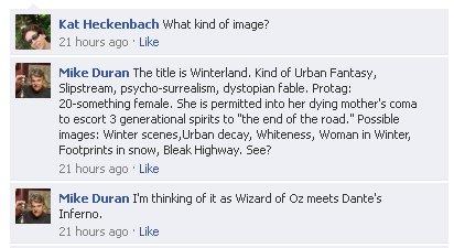
Okay. Do you see my problem? Do I emphasize the Wizard of Oz part or the Dante’s Inferno part? Do I choose a cover that screams Psycho-Surrealism or Dystopian Fable? The image below, a scene from The Road, sums up some of the story’s feeling. Bleak. Charred. Ravaged.
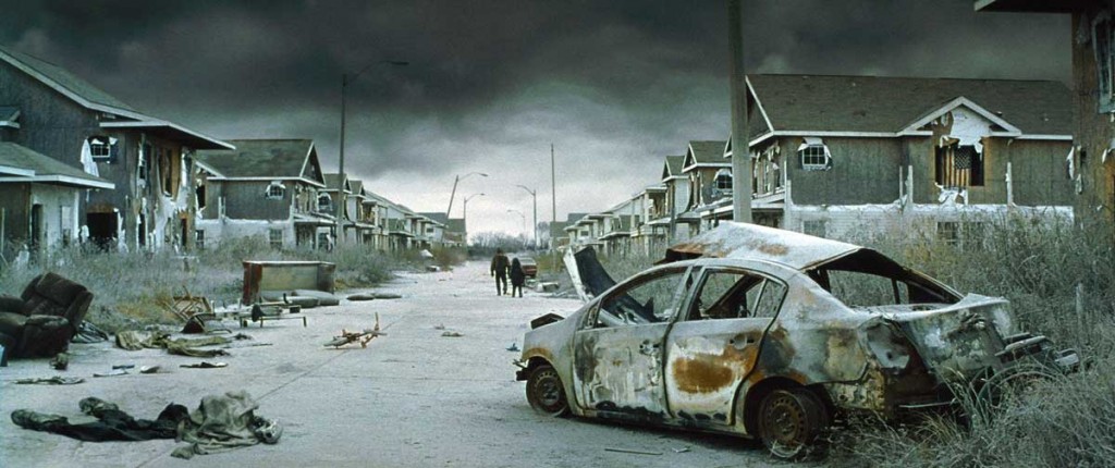
But it’s not the primary mood of the story. There is humor. There is satire. There is redemption. There is a Pilgrim’s Progress sort of parody.
And there are monsters.
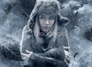 But most of all, there is a 20-something recovering meth-addict who is trying to forgive her dying mother and exorcise a boatload of regret. Which is why I just loved this picture (not purchased) from iStock Photo (see original HERE).
As you can probably see, there’s pros and cons to this pic. PROS: Young woman, slightly fearful, creepy atmosphere, winter. CONS: It’s too YA-ish. That was the initial response of one of my favorite writer friends. And I think she’s right.
Urban Fantasy author and critique partner Merrie Destefano is not just a fantastic writer, she has a great eye for design. In the process of deciding what to do with Winterland, Merrie and I have talked. Merrie’s got an e-book novella of her own soon to be released. Before her publisher picked up the book, Merrie 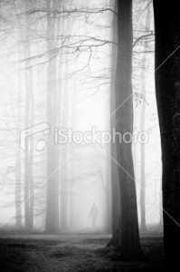 had developed her own cover. She showed it to our critique group one weekend and, trust me, it rocked.
So Merrie volunteered to assist me in the cover design / search process for my novella. (Whatta pal!) Along the way, she said something that really resonated with me. Merrie finds cover design therapeutic. As opposed to writing and editing which can be a slog. My e-Book Cover Quest may sound like a grind, but it hasn’t been. In fact, it’s kind of energized me to this writing gig.
Wondering how many of you authors have felt a similar exhilaration.
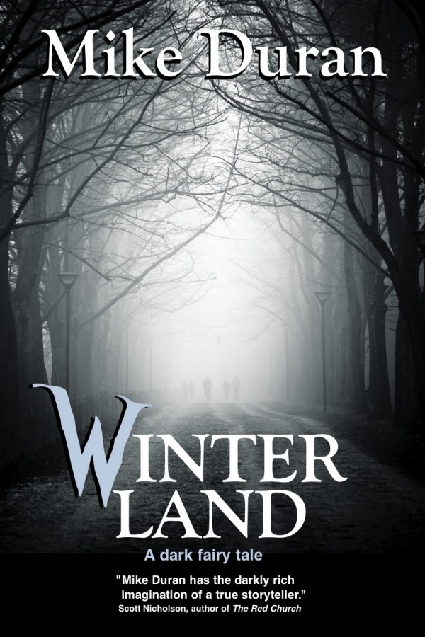
Anyway, at the moment, I am leaning towards an image similar to the one above. (Once again, an un-purchased iStock pic.) Yep, it’s pretty plain. But it’s also moody, atmospheric, with some brightness down the road. (And as bleak as my stories tend to be, I can’t seem to escape the Light at the end of the tunnel.) The important part of a cover  like this, I think, would be the choice of font. Just think what a blood red Gothic W could do for this cover. Or how about an Alice in Wonderland ambiance (like this font right here) to counter a too-bleak landscape? So many possibilities!
All that to say, I’ve been having a load of fun. Thanks to all who’ve pitched in. Look for Winterland to be available sometime next month.


I am still only halfway through Winterland. I love it, but I am in the middle of a major life changing moment that is stalling my reading, writing, and lots of things. One thing I don’t miss is watching television, by which I mean I haven’t been watching and have not missed watching it a bit.
As for the cover, I saw the tweet yesterday and thought, “Yes, it is.” Very difficult. The samples you show in this post do fit aspects of the story. To be honest I like the first one except for the rusted car. The third one strikes a cord and is the closest I could imagine for your cover. Yet even that one doesn’t quite hit all the aspects.
Your novella analysis is quite interesting, too. Originally I completed my novella length allegory of the book of Jonah and began looking to get an agent/publisher. After several rejections I was finally told how difficult it is to get a novella published. This caused me to move on to my work in progress, a science fiction novel, that has some references that may make the novella a publishable piece later. In my market research (three nights ago) in preparation of looking for an agent I stumbled upon a very interesting quote from a guy named Mike Duran which made something in my head really click. I have a feeling that I will soon be doing a lot more delving into the Duran body of work.
Hey Mike. Thanks for the shoutout!
I’ve done a lot of graphic and web design the last decade and it’s always a rush to see the final product. It’s even better, though, when it’s a printed thing. It’s like giving breath to existence rather than pixels.
I don’t know how much Photoshopping you’re wanting to do, but I can see something using all the sample imagery you posted.
Imagine we’re looking at an extreme wide angle or sphere-ized image of a post-apocalyptic street like the one you posted. The “camera” of the cover is in the center of the street, pointing right down at the protagonists walking down the snow-covered street. The top part of the image is shows the image as we see the misty horizon. The bottom is a misty/snowy horizon that the characters were walking from, with their footprints trailing behind them. Because of the wide angle sphere-izing, the bottom part of the image is upside down. On the sides of the image are the buildings in extreme perspective. The Winterland title on top in the midst of the haze.
Not sure if I described that like I see it in my head. Sort of like things reflected on a silver ball. It gives you almost the full 360 degree view in one distorted image.
Victor, I don’t have a lot of time for Photoshopping, which why I initially considered hiring someone. But I do like your idea and think you described it great. Thanks!
The problem w/ stock photos is that they look like stock photos. They lack the appeal of authenticity because they’re so manipulated. The forest one above would need a little work–it bleeds off to the left, for a start, and you want a design that draws the eye to the title or even the figure in the image. I’m not much of an artist. If I were to self-publish, I would avoid stock images, though. I really don’t like them.
Personally, I loved the first image with the car. I really grabs the attention in a way none of the others posted do. One of the things about post-apocalyptic stories is the struggle for survival, the courage to keep on, to soldier on and continue in the face of ultimate adversity.
It’s also my favorite genre, so maybe I’m biased. 🙂
Yes, Shawn, Winterland is very post-apocalyptic. This apocalypse, however, is in someone’s psyche. Thanks so much for commenting.
Just read a post about favorite covers. Granted it’s a YA author who linked to a YA carnival featuring this question: This Week’s Topic:
What are your all-time favorite book covers?
Because covers are your thing, Mike, I thought you might be interested in seeing what others thought.
Becky
Great link, Becky. Thanks!
“Merrie finds cover design therapeutic.”
That resonates with me too. I usually switch creative streams to art or music composition when the literary stuff becomes a bit sloggy.
You could also do something like the Styx Grand Illusion cover, with post-apocalyptic imagery showing inside negative space of the trees.
While it is always dangerous to assume we do tend to do that from time to time, so I’ll just ask if you saw Michael Hyatt’s post a few days ago on packaging? One of his steps was talk to customers, which is what you are doing here.
http://michaelhyatt.com/10-tips-for-developing-eye-popping-packaging.html
No, I hadn’t seen that link, Jonathan. Thanks!
Yes, I also find this kind of stuff theraputic. I loved all the images in the post above.
I think a pristine winter scene, broken by something ugly, like one of the burned out cars.
I’d give you some suggestions, but I think the process will be a lot more fun if you figure something out yourself. I love the font though. And the story sounds fantastic.
Best of luck.
Thanks for the mention! I’m so glad my post helped you!
Cover design’s so much fun. (Then again, I also find proofreading and sudoku fun, so maybe I’m not the best judge.) I never expected to like it.
^_^ Nice to see that you’re finding the process beneficial, too.
I agree, it is fun and theraputic to think and work on a cover image. However, if I’m being honest about my weaknesses, I’m not great at creating what I visualize. It always comes up way short. And having an artist as a husband who’s been thru graphic design classes, I know a subtle shift of text or an image can have a huge impact on the viewer’s either positive or negative reaction. So, at this point, I’ll leave the cover design to my husband or another trained artist.
A combo of the trees image with that logo would definitely catch my attention.