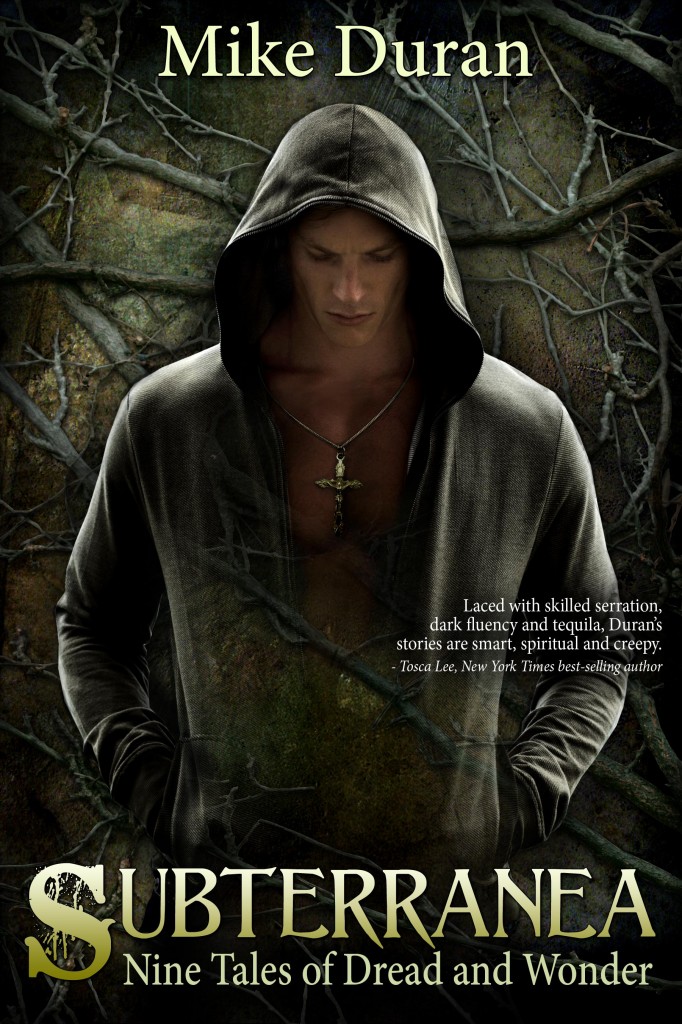
Okay. Some of you have already mentioned the new cover to my soon-to-be-released short story anthology, “Subterranea.” After listening to your feedback, I agreed that the last cover (which I thought looked great, BTW), was missing the target and not communicating the right things. Once again, huge thanks goes out to Ravven, cover artist extraordinaire, who did such a great job on this. I think this version captures more of the “dark fantasy” vibe without the “paranormal romance / erotica” implications. (Yikes!) Anyway, the collection is being formatted now and will be released Tuesday, November 13th.
Cover Reveal Redux: Subterranea
Next post: Should Christians Bother Trying to Change the World?
Previous post: My 10 Favorite Horror Movies


I would stop an read the blurb and sample this book when browsing/skimming covers. Good job.
I totally agreed with the majority view on Version One (50 Shades of Mike Duran); and love Version Two. Mystical, moody & evocative, sans excessive skin…
“50 Shades of Mike Duran.”
Wherein Mike reveals his love for latex, butter, and cryptozoology.
Oh dear. What? No lycra? 😛
I didn’t want to say anything before, but I’m glad this guy put a shirt on ;). If you don’t mind a little more *slight* criticism, the crucifix seems off center, (I know jewelry is rarely where it should be, but it caught my eye), and I’m confused about why the middle of his sweatshirt fades into the background. Take that input as you will. Looking forward to reading this regardless.
“…I’m confused about why the middle of his sweatshirt fades into the background.”
Because he’s not all there.
This one is fabulous. It even has echoes of monks (the hoodie). Works. And really, having it look good AND work for the audience, it’s a win.
Oh, I didn’t catch the monk thing, but now that you mention it… yes! The man’s hoodie is evocative of a monk’s robe. Nice!
Yeah, this one is pretty good. The man in the hood makes me think of Altair from Assassin’s Creed, and is much more mysterious and masculine. Looks even nicer in the smaller picture on the side of the of the page.
Was the same cover blurb on the old version and I missed it? I love that quote. It catches my eye and makes me want to know more!
Ravven does some awesome work. I’m a new fan.
Yes. Much better. This says angst, and urban, and dark. 🙂